
Font formatting is a powerful tool to make content more scannable and easier to read. Be mindful of the differences in how text displays across devices.
Font hierarchy
Headings help claimants quickly scan your UI application and site to find the information they need to complete tasks. Use headings to structure content into clear sections. Headings for sections that are at the same level should have consistent font styling.
 Needs improvement
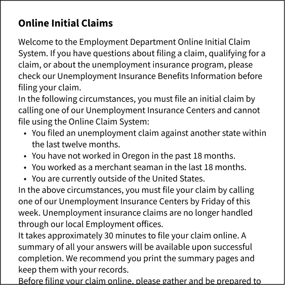
Using the same font size for section headings makes it harder for claimants to scan the page and find what they need faster.
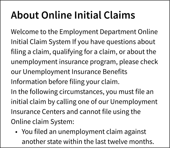
 Better

Using proper heading structure to indicate the organization of each page of your UI application and site.
Wrap text to fit screen width
Set text to wrap to fit the width of the page to ensure that the text doesn't overflow the page. Long text spans can easily create horizontal scrolls or cause layout misconfigurations by pushing other elements out of place. Setting the text to wrap helps you control how your claimants access the content of your UI application and site on mobile devices.
Needs improvement

Text is cropped at the right margin, resulting in horizontal scrolling.
Better
Wrap text at the end of the line to fit the screen width.
Make body text readable
The text of the UI application and site should be easy to read at a comfortable distance from the screen. The ideal base font size for mobile screens is 16 pixels. Anything smaller will likely force claimants to pinch the screen and zoom in and out to read the text.
Needs improvement

The text is too small – claimants may need to squint and pinch the screen to access the UI application and site or learn about their benefits.
Better
The font size used for mobile screens is 16 pixels, and claimants can read the text without zooming in and out.
Make help text readable
Help text provides an informative description that gives more context about what a claimant needs to input. Make help text readable, accessible, and easy to use and understand. On your desktop websites, if your state UI uses tooltips, short descriptive messages that appear when claimants' hovers or focuses on an element on the UI application and site, please consider replacing those with helper text. Often, tooltips used on desktop websites aren’t compatible with mobile devices. Help text provides claimants with the context they need to avoid making errors and can help claimants process information more efficiently.
Needs improvement

Hiding essential information inside a tooltip makes it hard for claimants to complete the form correctly.
Better
Help text displays next to the form field, providing guidance or clarification about what the claimant should enter in the input field.