
Using a small keyboard on a mobile phone can make it difficult to type. To make it easier for claimants filling out forms on their phones, it is best to provide options where they can tap or select instead of typing. It is also helpful to show the right kind of keyboard on their screen as they are typing. Additionally, when a claimant is typing numbers, the form should automatically format their entry.
Stack form elements
Input fields are the areas of the UI form where claimants type in information or choose options, including text boxes or buttons. Field labels are directions or questions that tell claimants what to enter in each field. When creating UI applications and site for mobile, a best practice for mobile usability is to arrange the labels and fields on top of each other.
For claimants filling out forms on their mobile devices, it’s easier to understand what they need to do if words are above the spaces where they need to write. Placing field labels at the top of the input field allows you to fit longer words, make the text bigger, and more easily accommodate different languages.
 Needs improvement
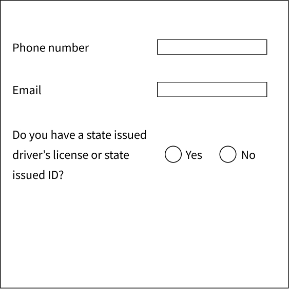
Placing field labels and input fields side by side since it can be harder for claimants to input text and know which fields are tied together.
 Better
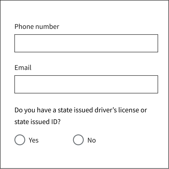
Stack and align field labels to help with readability and easier input.
Reduce typing
Reduce the typing required to complete a UI application and site by displaying the options available to claimants as checklists, radio buttons, and dropdowns. You can present short lists with options or use predictive functionalities as an alternative to scrolling through the longest lists (country or state). Remember that input fields requiring one touch to select an option create an easier mobile experience.
Needs improvement
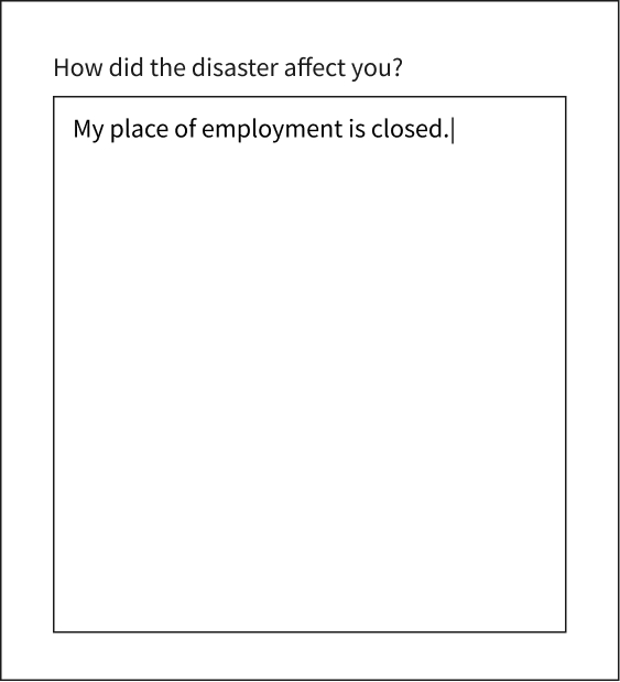
Text boxes and text areas on mobile devices increase the need and difficulty of typing since it can be harder to type on smaller screens.
Better
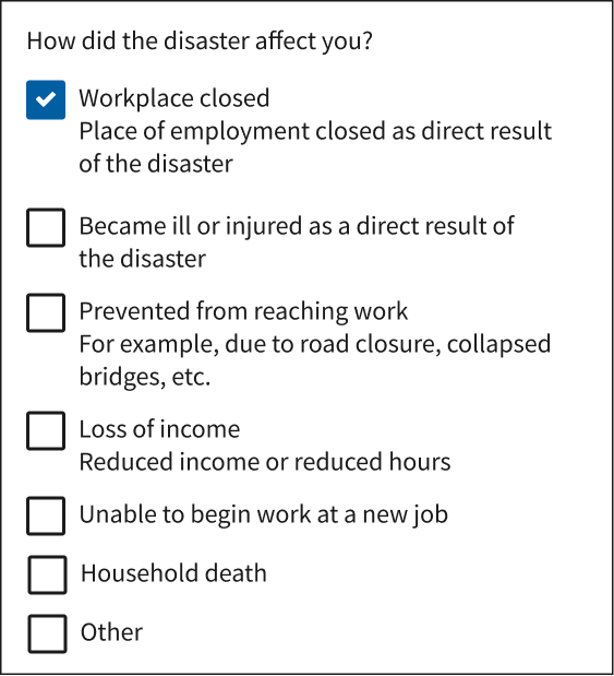
Minimize the need for typing by using form features such as checklists, radio buttons, and dropdowns.
Use the correct keyboard
Form input fields should trigger the correct keyboards (numeric or alphabetical) to reduce the amount of typing and effort required to complete your UI application and site on mobile. When tapped, input fields should trigger the numeric keyboard if the input field requires numbers (for example, a phone number or a Social Security number) and the alphabetical keyboard when text is required (for example, a name or explanation).
Needs improvement
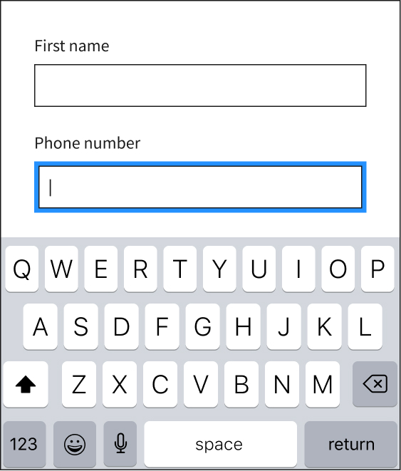
Tapping the input field triggers the alphabetical keyboard automatically, even when claimants need to add a phone number.
Better
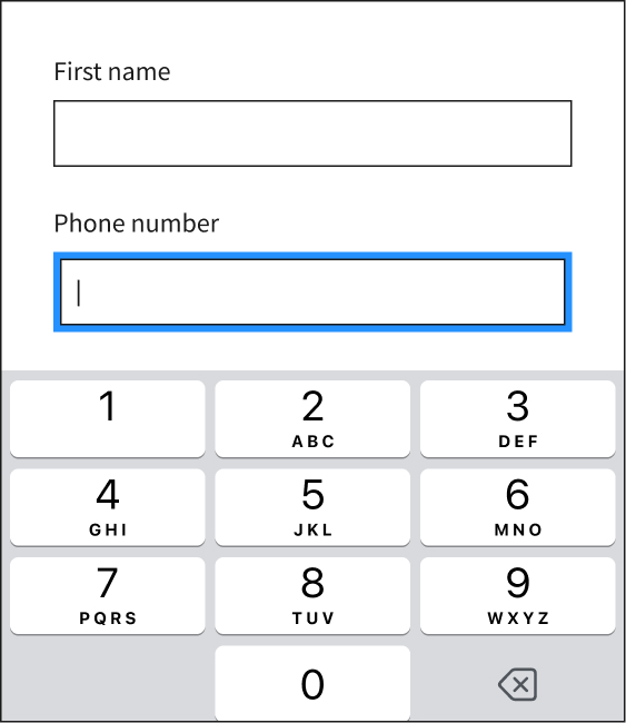
Touching the input field triggers the correct keyboard (which for this field is numeric), making it easier for claimants to enter the information requested and reducing the likelihood of mistakes.
Use auto format
As claimants enter numbers on your UI application and site, the application and site should automatically apply the desired format. Adopting this approach prevents confusion and helps the claimant identify possible entry mistakes.
Needs improvement
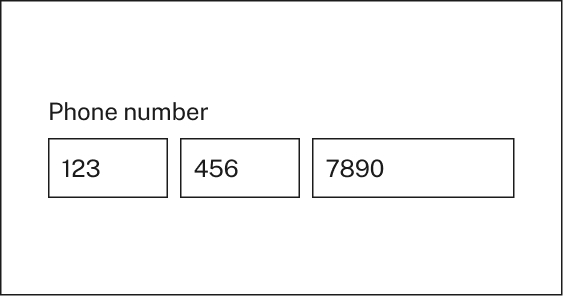
Requiring claimants to format numbers or to divide the number across multiple fields.
Better
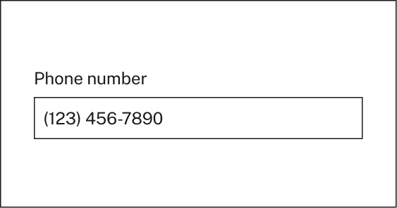
Set fields to automatically display numbers in the preferred format as the claimant types.