
Layout plays a key role in mobile usability, functionality, and appearance, and greatly impacts claimants’ mobile experience. Layouts inform the structure and visual elements of the UI application and site.
Stack elements to fit the screen width
Stack elements that take up multiple columns on desktop to ensure they remain readable on mobile. Stacking elements guarantees that the elements fit the mobile device screen size, so they don't roll over or get crammed.
 Needs improvement
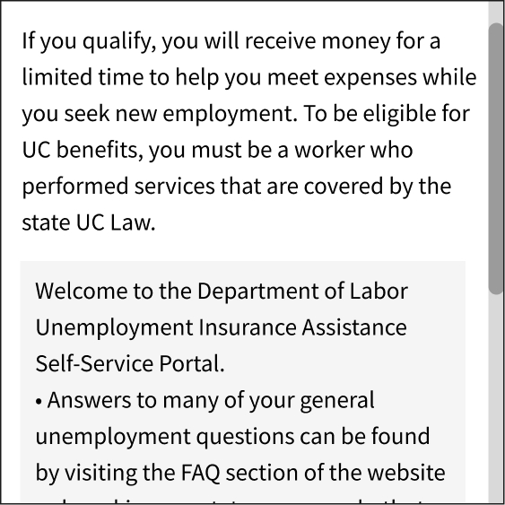
The information doesn't fit mobile devices' screen width and is displayed in multiple columns, not a single column.
 Better
Fit elements to the screen size and stack them under a single column.
Reduce header height
Remove unnecessary elements from the header. For example, avoid including in the header elements that offer aesthetic value without providing information. Use elements in the header that are important for the claimant experience. Consider replacing navigation links with a menu designed for small screens.
Needs improvement
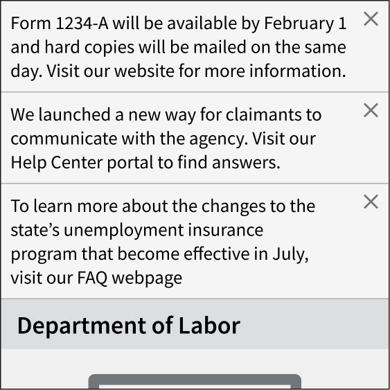
Using long headers, especially if they are mainly decorative and do not serve a specific function.
Better
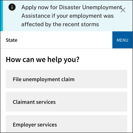
Remove large logos, large images, tall lines for the state and agency names, and horizontal menus. Replace desktop navigation with a responsive menu.
Standardize page length
Use a standardized page length, which will determine the maximum amount of content that can appear on a page, rather than allowing each page's length to be determined by the content. Design a standardized layout for your UI application and site pages that considers page length and the amount of content each page should include.
A standardized page length throughout your UI application and site can help break down content or forms into smaller pages. This allows claimants to find key information and tasks easily without having to scroll far.
Needs improvement
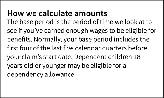
Long pages containing too much information that could be broken down into shorter, more targeted pages.
Better
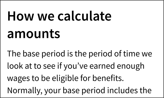
A standardized layout for your mobile UI application and site pages that limits content length, making the content more scannable and less overwhelming for claimants.
Reformat tables to stack
Reformat tables so they collapse and stack at narrow widths for better readability on small screens. Keep in mind that even responsive tables that adjust and accommodate to fit different screen sizes can be difficult to read on mobile devices. Multiple columns become harder to comprehend, and claimants may lose their place when scrolling on mobile devices. Similarly, try to reduce the information displayed in tables to show only what claimants need to know. This will help with readability on both mobile devices and desktops.
For more table design practices that can improve mobile usability, check out USWDS' table guidelines.
Needs improvement
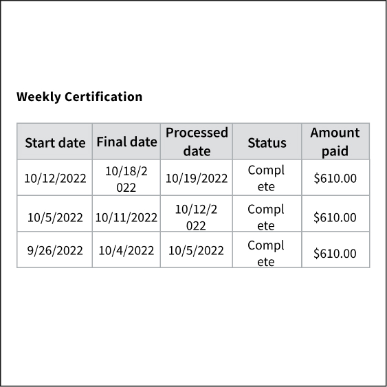
Simply shrinking the table for mobile devices, which makes the information harder to read.
Better

Stack columns vertically to fit the screen.
Use white space
White space is the blank or empty space surrounding the elements on a page. This space helps organize and structure your content. For example, white space can help divide content into meaningful sections and group related topics together. Use white space to separate each section. Make sure the white space is proportional to the size of the screen.
Needs improvement
Elements are too close to each other, making the content harder to read or scan.
Better
Leave adequate space between elements so claimants can easily read the page.
Use one scroll bar on a page
Ensure each page has only one scroll bar (a component that moves a page up and down). Your websites should not contain areas where only the content of that area moves up and down independently from the page. Multiple scrolling elements on a page create a confusing experience for claimants accessing the website from a mobile device and can inadvertently hide important content.
Needs improvement
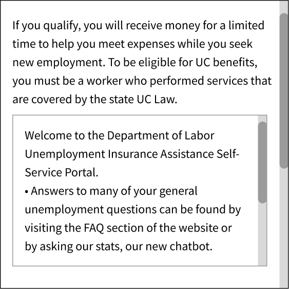
Elements within the page that require scrolling to display the content inside them.
Better
Make sure each page has only one scrolling interaction that moves the entire content of the page.
Limit alert banners
Limit the use of alerts to information that is relevant to most people visiting your website. On desktop, alerts are a helpful way to call attention to time-sensitive information. However, on mobile devices, alerts take up space that could be better used for other, more relevant content. They can be disorienting for claimants, block content, and push down key information. Manage alerts appropriately and take them down once the situation is no longer critical.
Needs improvement
Multiple alerts on a single page, including non-time-sensitive updates and alerts containing long blocks of text.
Better
Limit alerts to information that is time-sensitive and relevant for most people visiting the website.
Create easy-to-tap elements
Make buttons, links, and other interactive elements large enough so that claimants can tap on them without accidentally pressing on nearby elements; also be sure to include enough white space around each element. Generally, tap elements or touch targets should be at least 44px or 10mm (including padding).
Needs improvement

Buttons or links that are very small or close together.
Better
Make tap elements 44 pixels or 10mm (including padding) to be easily tapped by the average adult finger pad. In this example, the touch targets are about 8 pixels apart from each other.