
Dashboard overview
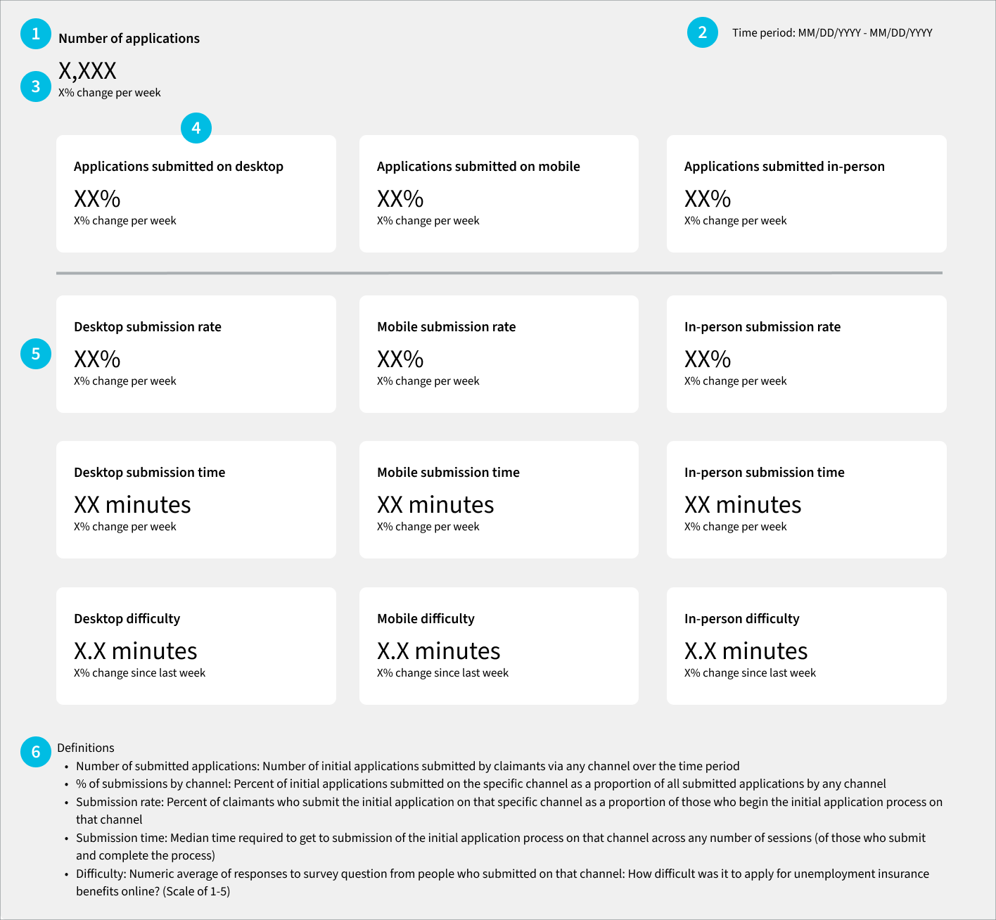
In this example dashboard, we’re assuming an audience of agency leadership stakeholders who want to know at a glance what the customer experience (CX) is for claimants submitting an initial UI application via the different filing access points, also known as “channels” (i.e., in-person, mobile web, or desktop web).
Given this purpose, we selected just three CX metrics (submission rate, submission time and difficulty) and situated them in the context of other metrics related to how many applications are submitted via each channel. To keep the dashboard succinct, we chose not to include details about where people drop off in the process; that information would instead be included in a separate dashboard or analysis.
This example dashboard does not show any real data but is intended to show the structure of the dashboard page and the type of data to be included. It is annotated with numbers that correspond to commentary below to explain the different pieces and provide some dashboard best practices.
Dashboard commentary
1. Give the dashboard some context.
In this case, we have several data points that will provide context to the CX metrics, starting with what is the total number of new UI applications. In the definitions section of the dashboard, be sure to mention whether this number (and the rest of the metrics on the dashboard) includes reactivated claims or not. Depending on the goals of the dashboard, it might help to also show a breakdown of claim type as well (i.e., Combined Wage Claims, Unemployment Compensation for Federal Employees, or Unemployment Compensation for Ex-Servicemembers), or have an additional dashboard that shows how these metrics differ across claim types.
The dashboard also shows how many people complete the application on each channel with the Percent of Applications metric. Include as many channels as appropriate for the state’s system or process (e.g., mobile web, desktop web, Interactive Voice Response system, in-person, by mail, by fax, or other). This is important for a comprehensive understanding of how and where people are interacting with the system.
2. Show what time period the data is covering.
This dashboard shows that the data is covering a specific one-week time period. It should get updated along with the rest of the dashboard’s data.
While this dashboard isn’t designed to be interactive, more advanced dashboards might let a viewer change the time window to see data for a different week, or for a longer or shorter time period.
3. Give each Th context.
With the dashboard just showing raw data for a set time period, having some indication of whether the metric has changed over the course of that set time period or compared to another period is important. In this case, we’re suggesting to show the percent change from the same period in the previous week. An alternative would be to show a 12-week trailing average if the week-over-week change seems too volatile.
If any of the metrics used are tied to a specific goal value, either internally or related to other DOL reporting, then put that goal value somewhere on the dashboard near the metric to make it clear to any reader. Looking solely at data without the context of the goal will make it more difficult to spot issues or make decisions about where to focus state resources.
4. In this dashboard, each column shows the metrics for a given channel.
This way, a dashboard viewer can see the key metrics for that channel in a very structured way to get an understanding of what the overall experience is like on that channel.
5. In this dashboard, each row shows the same metric across the specified channels.
With the metrics laid out in this way, a dashboard viewer can see how the experience differs based on how someone is interacting with the system. E.g., is there a particularly different difficulty rating between applications submitted on mobile and those submitted on desktop?
If the system is sophisticated enough to track an individual across channels, there are options for how to count people. Does a person who started the application on desktop but finished on mobile contribute to the metrics in both channels, or are they counted only in the desktop metrics because that was their "first touch" channel? Whichever you decide, you should be consistent for all relevant metrics.
6. Include the metrics’ definitions on the dashboard itself.
This will enable more people to understand the dashboard on their own. The definitions included in the example dashboard are for the metrics we suggest, but a state will need to update the definitions on their own dashboard to reflect the metrics displayed.
If there are any caveats or limitations to the data in the dashboard that the dashboard’s viewers should know about, the definitions section is a good place to put them.